A frustrating journey with the Axis bank mobile app
A frustrating journey with the Axis bank mobile app
I’ve been using the Axis Bank mobile app for over a year now, and what started as a seemingly convenient way to manage my banking on the go quickly turned into a recurring frustration. The app’s poor user experience became glaringly obvious the more I interacted with it, particularly when logging in.
Despite being a loyal user, I found myself struggling with the same confusing menus, clunky navigation, and inconsistent design choices. The repetitive frustrations I encountered weren’t just minor inconveniences—they were fundamental design flaws that slowed down every interaction.
Our Focus
Our Focus
Inaccessible Layouts for One-Handed Use
Inaccessible Layouts for One-Handed Use
Confusing Information Architecture
Confusing Information Architecture
Inconsistent Visual Design
Inconsistent Visual Design
Impact made
Impact made
New UI outperforms by 25% in task completion time and reduces the number of clicks by 30%.
New UI outperforms by 25% in task completion time and reduces the number of clicks by 30%.
Offering more intuitive & accessible buttons, increased task completion rate by 35%.
Offering more intuitive & accessible buttons, increased task completion rate by 35%.
Pain points I have been dealing with
Pain points I have been dealing with
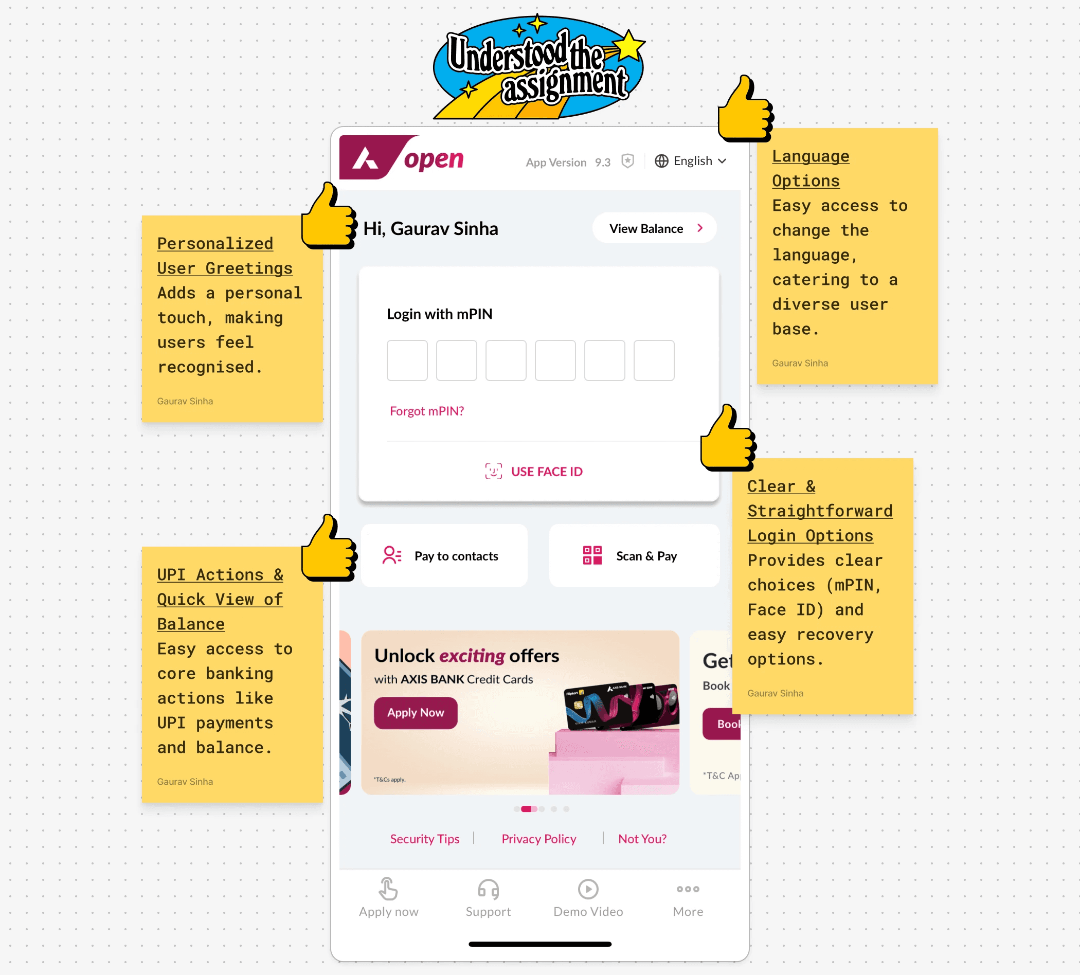
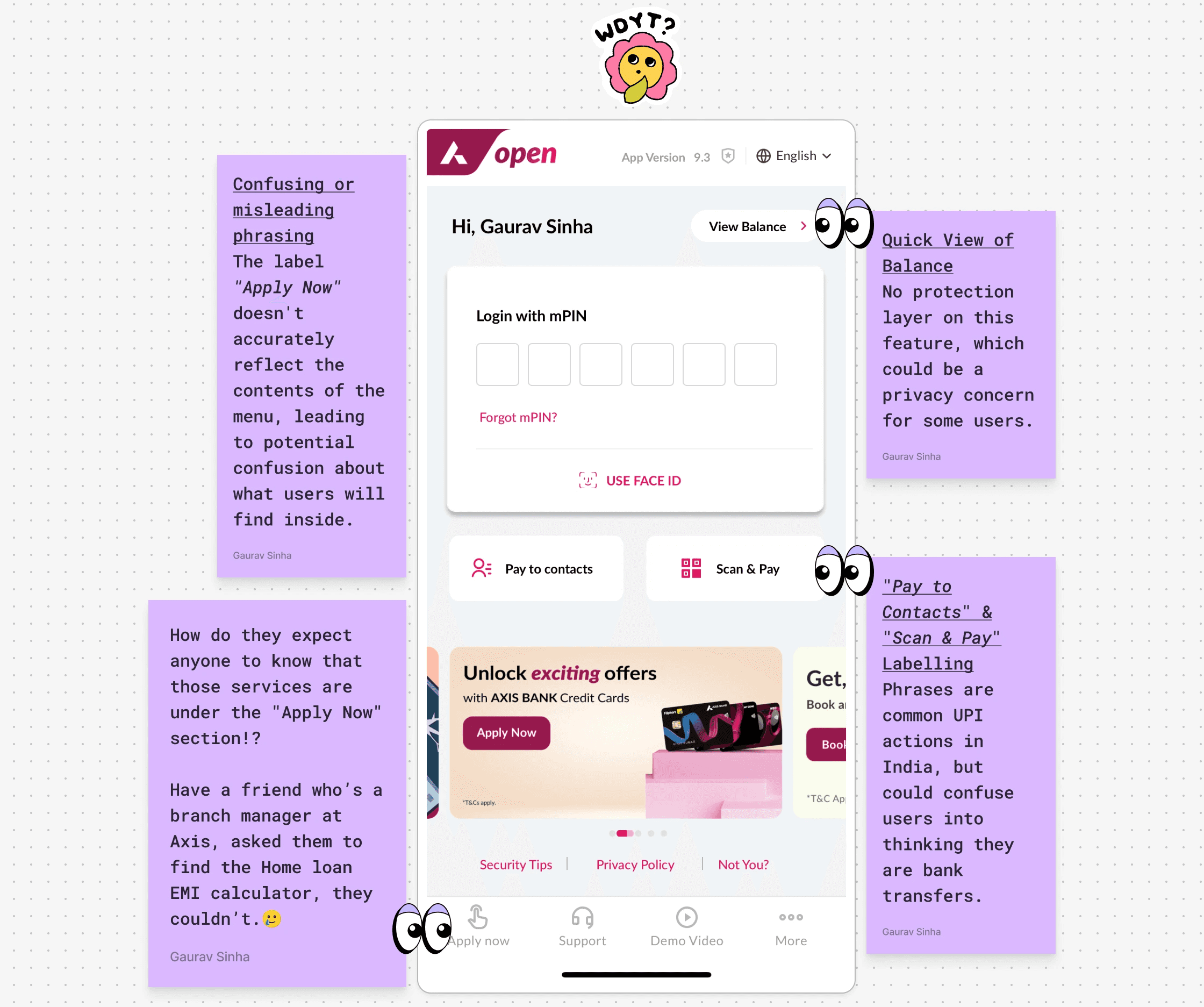
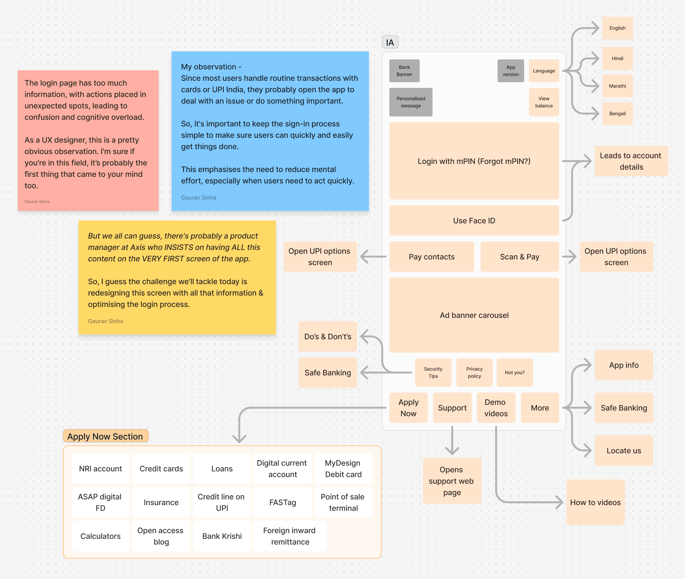
Logging in, resetting a password, or using Face ID is a nightmare of unnecessary steps. The app's menu is a maze, with critical functions buried deep within as you can see below. Users have to tap through several screens to find even the most basic options.
Logging in, resetting a password, or using Face ID is a nightmare of unnecessary steps. The app's menu is a maze, with critical functions buried deep within as you can see below. Users have to tap through several screens to find even the most basic options.
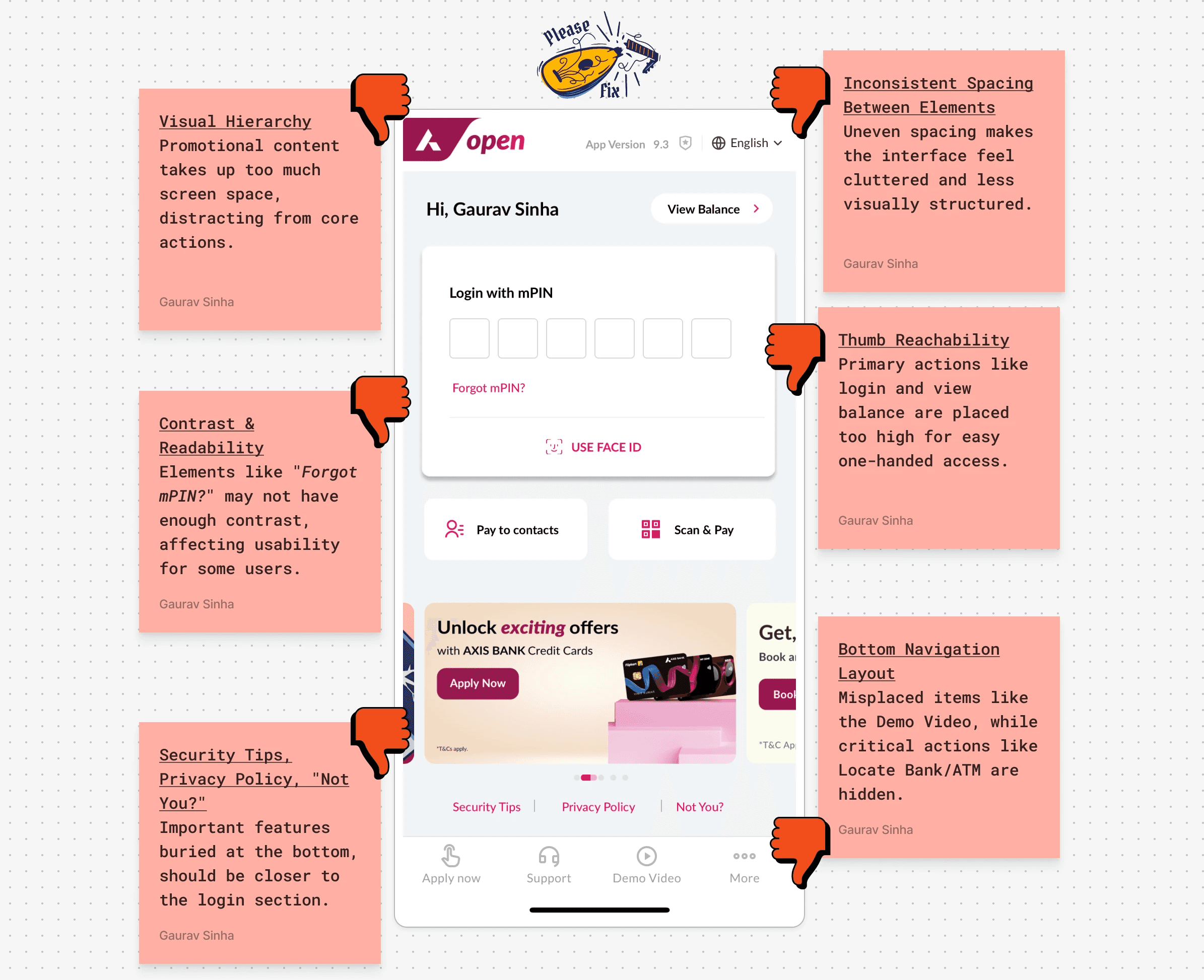
Inconsistent Visual Design
Inconsistent Visual Design
The app is visually disjoint.
Fonts and button sizes change across different screens, leaving users confused. There is no flow, no rhythm to the design—it feels as though the app isn’t guiding users, but rather leaving them to figure it out on their own.
The app is visually disjoint.
Fonts and button sizes change across different screens, leaving users confused. There is no flow, no rhythm to the design—it feels as though the app isn’t guiding users, but rather leaving them to figure it out on their own.
Thumb-Reachability Issues
Thumb-Reachability Issues
One of the first things you'll notice is how hard it was to navigate the app with one hand. Important buttons are placed too far away for easy access, forcing users to either awkwardly stretch their thumb or use both hands—something that’s frustrating in everyday mobile use.
One of the first things you'll notice is how hard it was to navigate the app with one hand. Important buttons are placed too far away for easy access, forcing users to either awkwardly stretch their thumb or use both hands—something that’s frustrating in everyday mobile use.
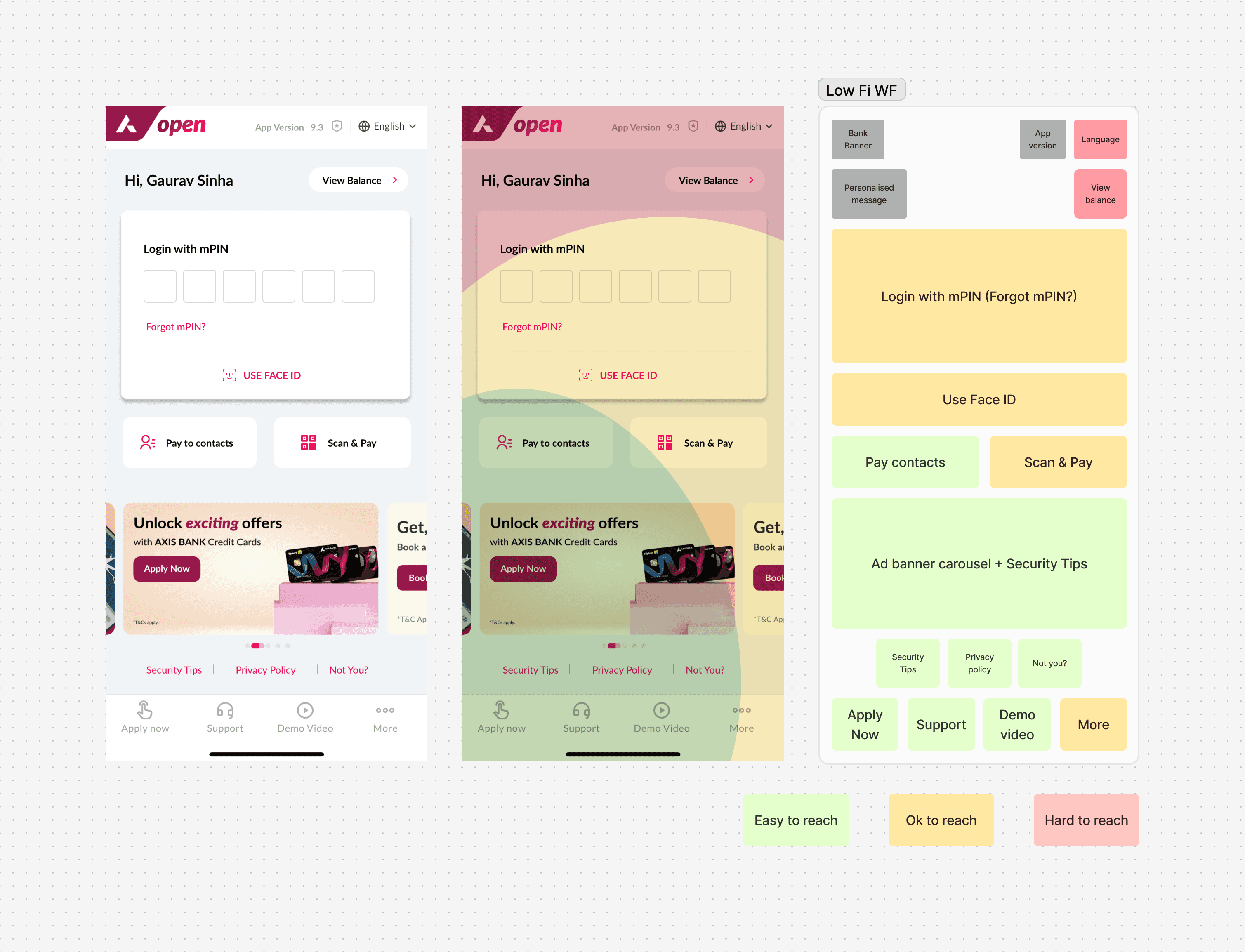
While putting things at the top might catch the user’s eye, it’s important for mobile apps to be easy to use with one hand.
While putting things at the top might catch the user’s eye, it’s important for mobile apps to be easy to use with one hand.
Primary actions like entering a password or using Face ID are placed too high, requiring a stretch.
Primary actions like entering a password or using Face ID are placed too high, requiring a stretch.
Even the quick balance check option is in a spot that's quite hard to reach.
Even the quick balance check option is in a spot that's quite hard to reach.
Ad banners and secondary or lower-priority actions are in the easier-to-reach areas of the screen.
Ad banners and secondary or lower-priority actions are in the easier-to-reach areas of the screen.
From a one-handed user's perspective, the placement of the buttons appears ergonomically suboptimal.
From a one-handed user's perspective, the placement of the buttons appears ergonomically suboptimal.
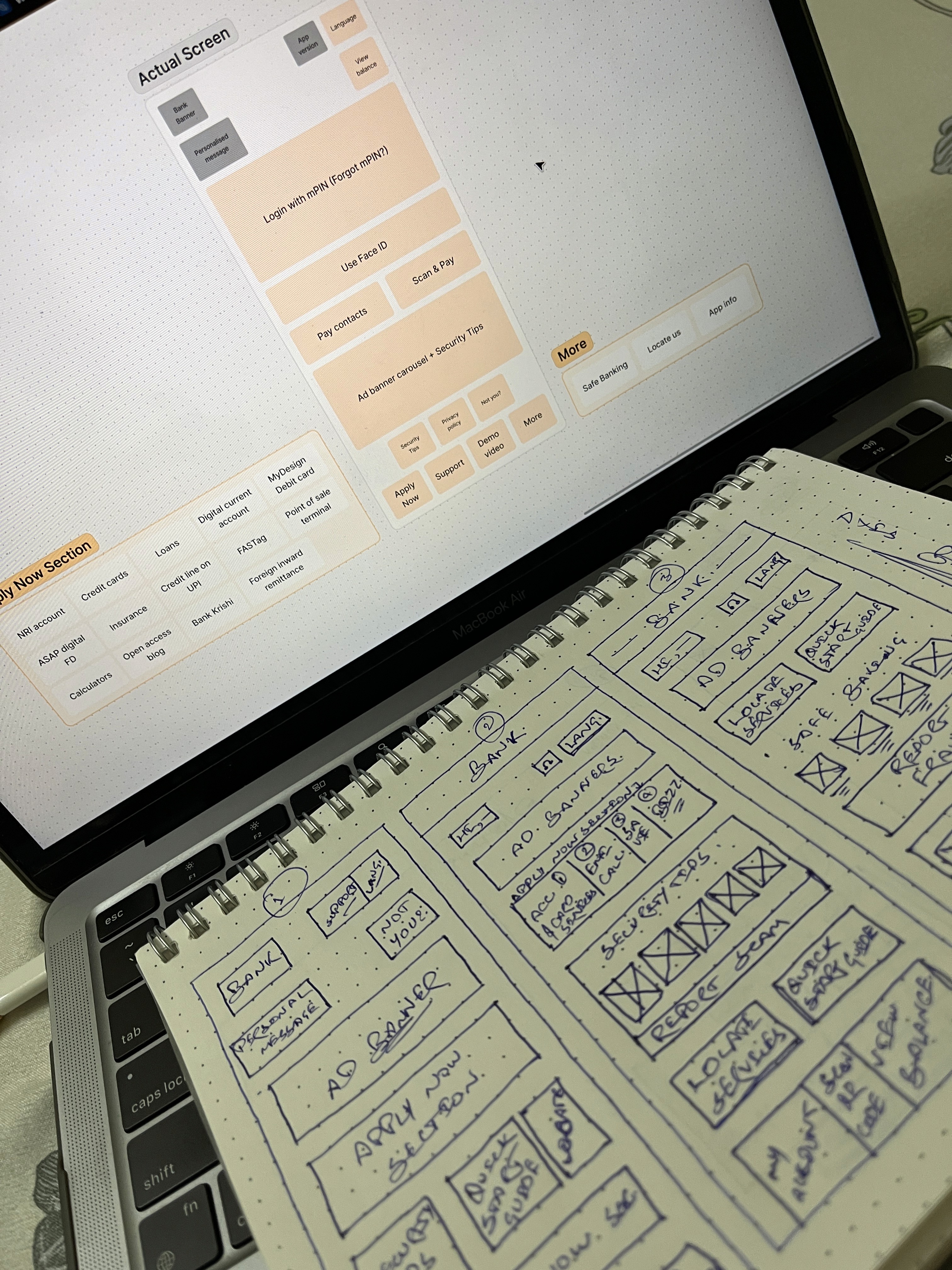
Let's start sketching!
Let's start sketching!
I started by addressing the thumb-reachability issue, something I hadn’t originally planned but quickly realised was essential. By re-positioning key buttons within the user’s natural reach zone allows them to operate the app with ease using just one hand, creating a far more fluid experience.
I started by addressing the thumb-reachability issue, something I hadn’t originally planned but quickly realised was essential. By re-positioning key buttons within the user’s natural reach zone allows them to operate the app with ease using just one hand, creating a far more fluid experience.
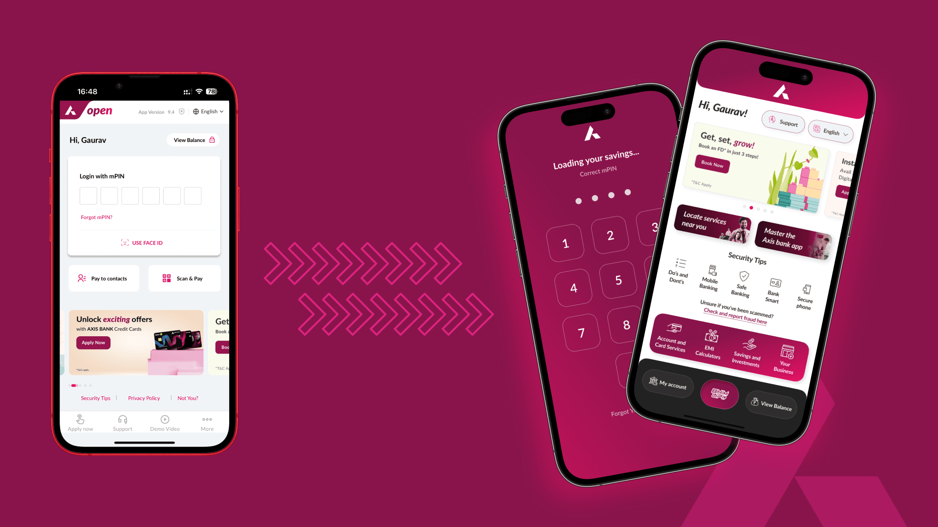
Simplifying the Login Flow
Simplifying the Login Flow
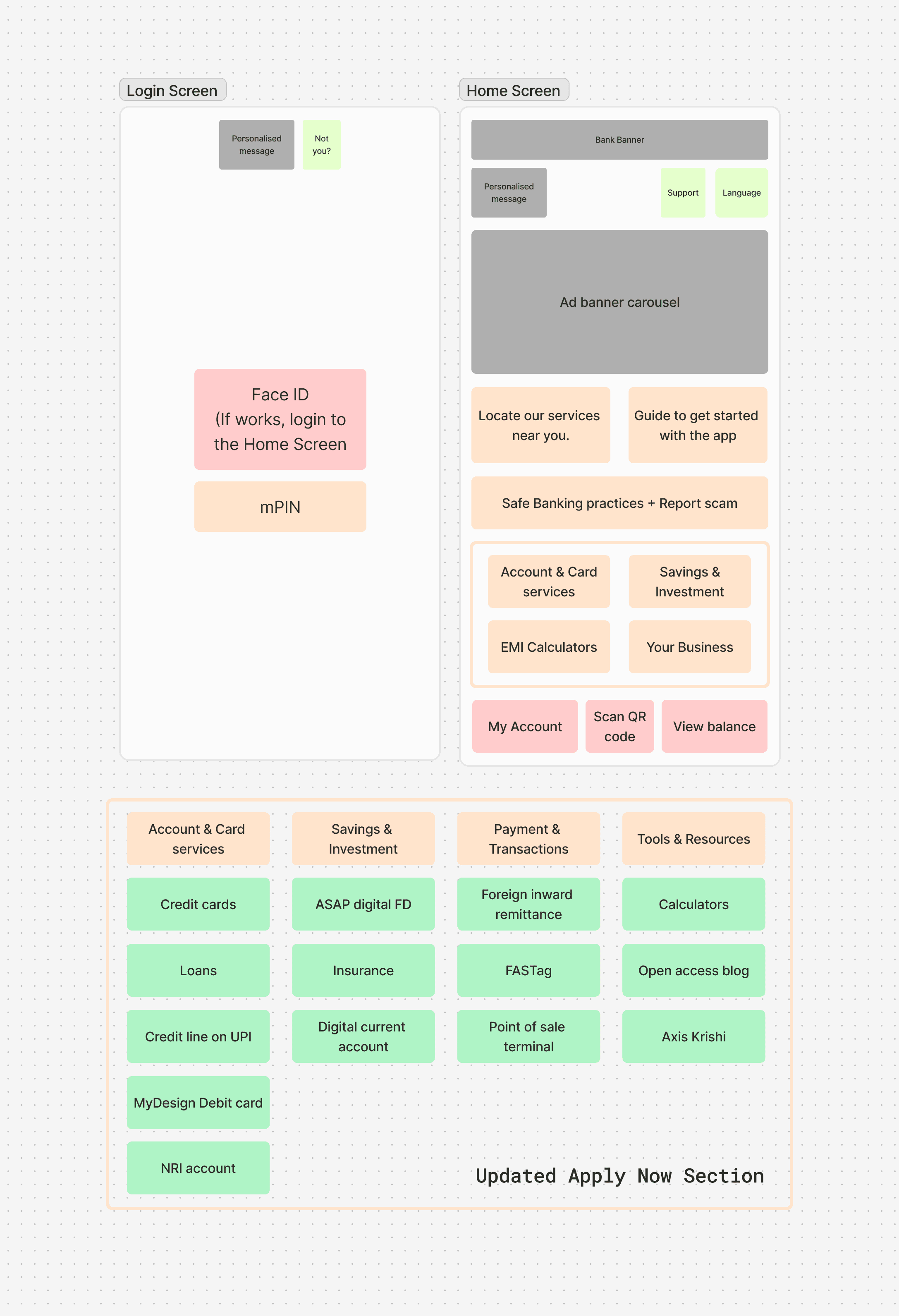
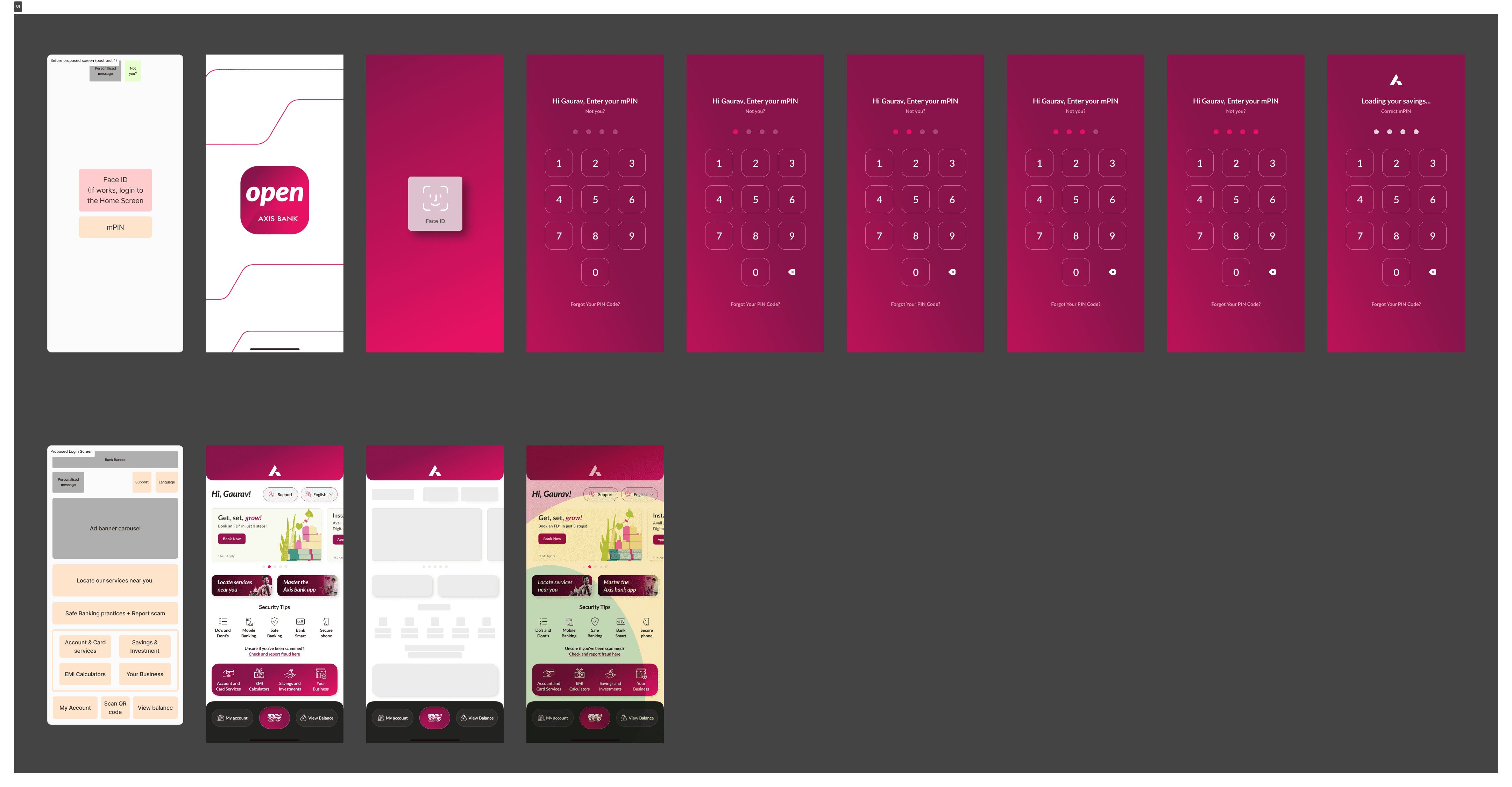
The login process was cluttered, and that needed fixing. Moved the mPIN and Face ID options to the very first screen—no more digging through menus. This change alone drastically reduced login times and made the experience seamless, as most users rely on these features daily.
The login process was cluttered, and that needed fixing. Moved the mPIN and Face ID options to the very first screen—no more digging through menus. This change alone drastically reduced login times and made the experience seamless, as most users rely on these features daily.
I reorganised the menus, bringing essential actions like password recovery and fraud reporting front and centre. With fewer taps required to get things done, users could now complete their tasks quicker, without the frustration of navigating through a labyrinth of unnecessary steps.
I reorganised the menus, bringing essential actions like password recovery and fraud reporting front and centre. With fewer taps required to get things done, users could now complete their tasks quicker, without the frustration of navigating through a labyrinth of unnecessary steps.
I reorganised the menus, bringing essential actions like password recovery and fraud reporting front and centre. With fewer taps required to get things done, users could now complete their tasks quicker, without the frustration of navigating through a labyrinth of unnecessary steps.
I reorganised the menus, bringing essential actions like password recovery and fraud reporting front and centre. With fewer taps required to get things done, users could now complete their tasks quicker, without the frustration of navigating through a labyrinth of unnecessary steps.
Putting together the new UI
Putting together the new UI
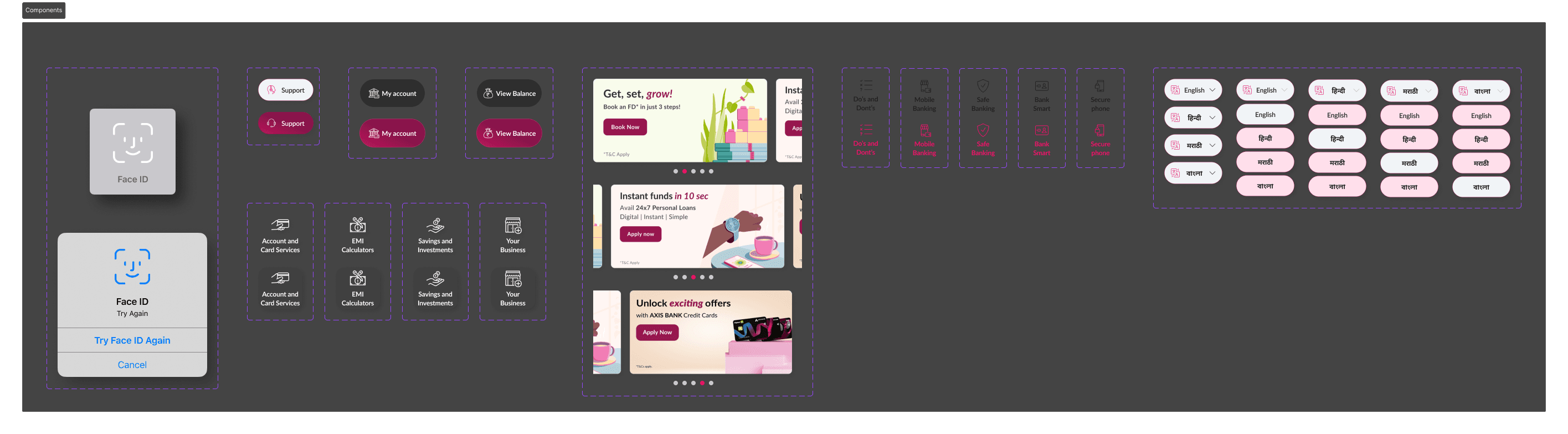
Consistency is key. Standardised button sizes, fonts, and interactions across the entire app, creating a cohesive user experience. No more guessing which buttons did what—the design now spoke a clear, uniform language that users could intuitively understand.
Consistency is key. Standardised button sizes, fonts, and interactions across the entire app, creating a cohesive user experience. No more guessing which buttons did what—the design now spoke a clear, uniform language that users could intuitively understand.
Updated Login Process
Updated Login Process
Moved the mPIN and Face ID options to the first screen, as most apps default to Face ID and only prompt for PIN if Face ID fails. I also moved the 'Not you?' button to this screen.
Moved the mPIN and Face ID options to the first screen, as most apps default to Face ID and only prompt for PIN if Face ID fails. I also moved the 'Not you?' button to this screen.
I also added loading screens that display the layout of the actual page before the home screen appears, in case of slow network connections.
I also added loading screens that display the layout of the actual page before the home screen appears, in case of slow network connections.
Updated Home Screen
Updated Home Screen
Addressed accessibility issues by increasing button sizes and repositioning primary actions for easier access.
Addressed accessibility issues by increasing button sizes and repositioning primary actions for easier access.
I also ensured consistent feedback for all user interactions.
I also ensured consistent feedback for all user interactions.
Updated UX writing that is more suitable for Indian users like using the BHIM UPI icon.
Updated UX writing that is more suitable for Indian users like using the BHIM UPI icon.
Assessing the impact of our design
Assessing the impact of our design
To objectively assess whether the changes addressed the identified issues, I conducted usability testing using Klever.
To objectively assess whether the changes addressed the identified issues, I conducted usability testing using Klever.
Here are the results comparing the original UI with the proposed UI.
Here are the results comparing the original UI with the proposed UI.
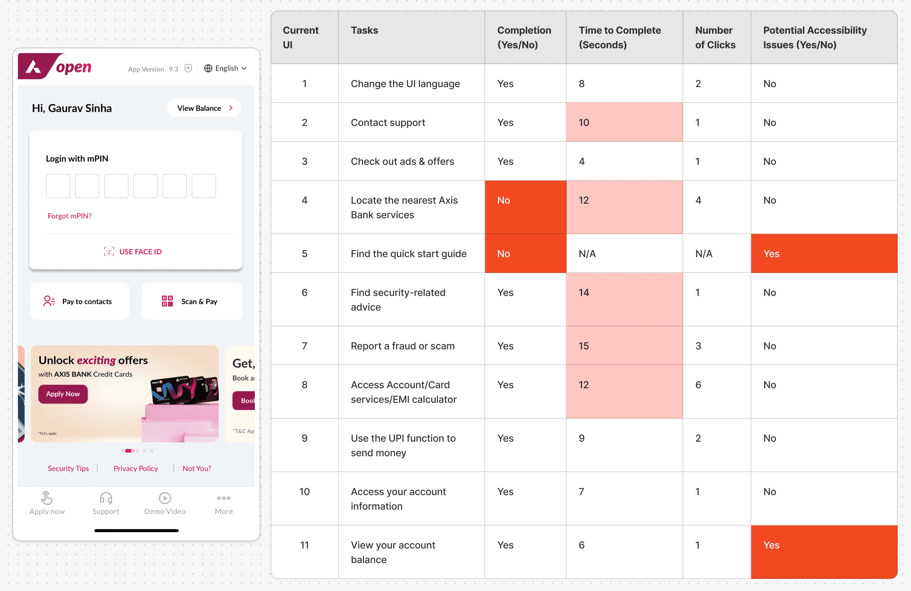
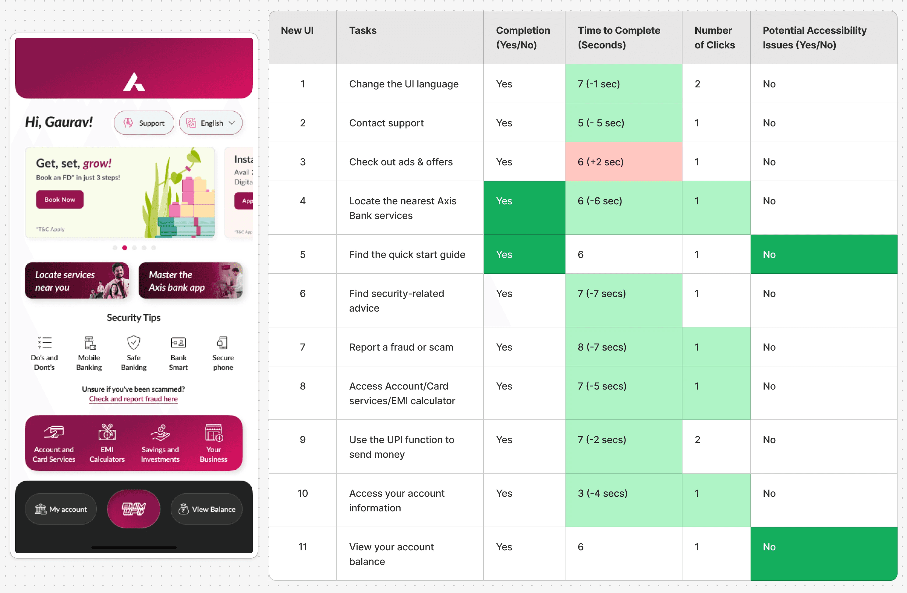
I ran this usability tests 4 times to confirm the results & the numbers were consistent.
I ran this usability tests 4 times to confirm the results & the numbers were consistent.
The new UI consistently outperforms the current UI in terms of time taken to complete tasks and the number of clicks required, suggesting a more streamlined and user-friendly experience.
The new UI consistently outperforms the current UI in terms of time taken to complete tasks and the number of clicks required, suggesting a more streamlined and user-friendly experience.
Button/Option Used
The new UI offers more intuitive and accessible buttons or options for completing tasks, with key functions more prominently displayed.
Button/Option Used
The new UI offers more intuitive and accessible buttons or options for completing tasks, with key functions more prominently displayed.
Accessibility
No major accessibility issues were found, but the new UI's layout is more user-centric, reducing the cognitive load and making tasks easier to complete.
Accessibility
No major accessibility issues were found, but the new UI's layout is more user-centric, reducing the cognitive load and making tasks easier to complete.
My take
My take
From my experience, apps aimed at South Asian users often load each screen with lots of content and options. This can make the UX feel cluttered compared to the simpler designs popular in Western apps. While this approach tries to attract a wider audience, it can actually make things harder for users by increasing mental effort (cognitive load) and making decisions more complicated.
In this case study, I've learned that businesses might not always follow strict design rules. But as a designer, my research skills allow me to create UIs that meet business needs while still providing a good experience.
I've shown that it's possible to apply good design practices that satisfy both the company and the users.
🙋🏽♂️ Enjoyed what you read?
🙋🏽♂️ Enjoyed what you read?
Thanks for sticking with it! I’d really value your feedback, and it’ll only take 30 seconds. Please rate or share your thoughts on my work. ❤️
Thanks for sticking with it! I’d really value your feedback, and it’ll only take 30 seconds. Please rate or share your thoughts on my work. ❤️
© 2025 Gaurav Sinha
© 2025 Gaurav Sinha
© 2025 Gaurav Sinha