Implement the feedback from usability testing on the first prototype and update the UI.
Feedback received from 5 participants
I conducted usability testing, contextual inquiries, and gathered user opinions on the virtual character and received the following feedback.
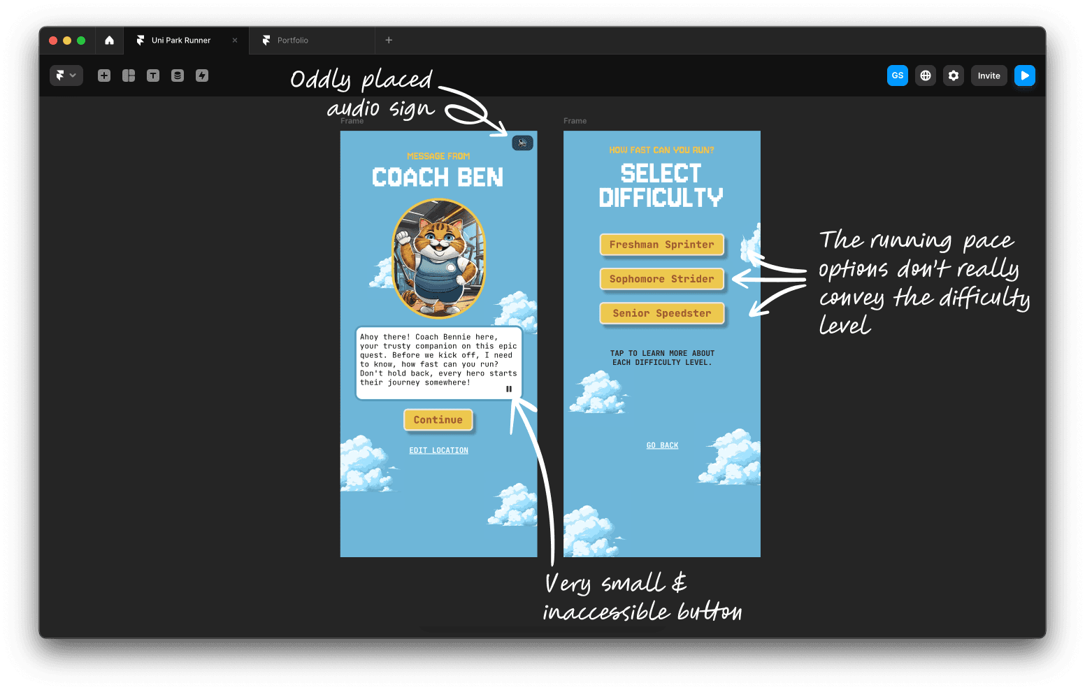
So will I hear Ben's voice on every screen or just this one?
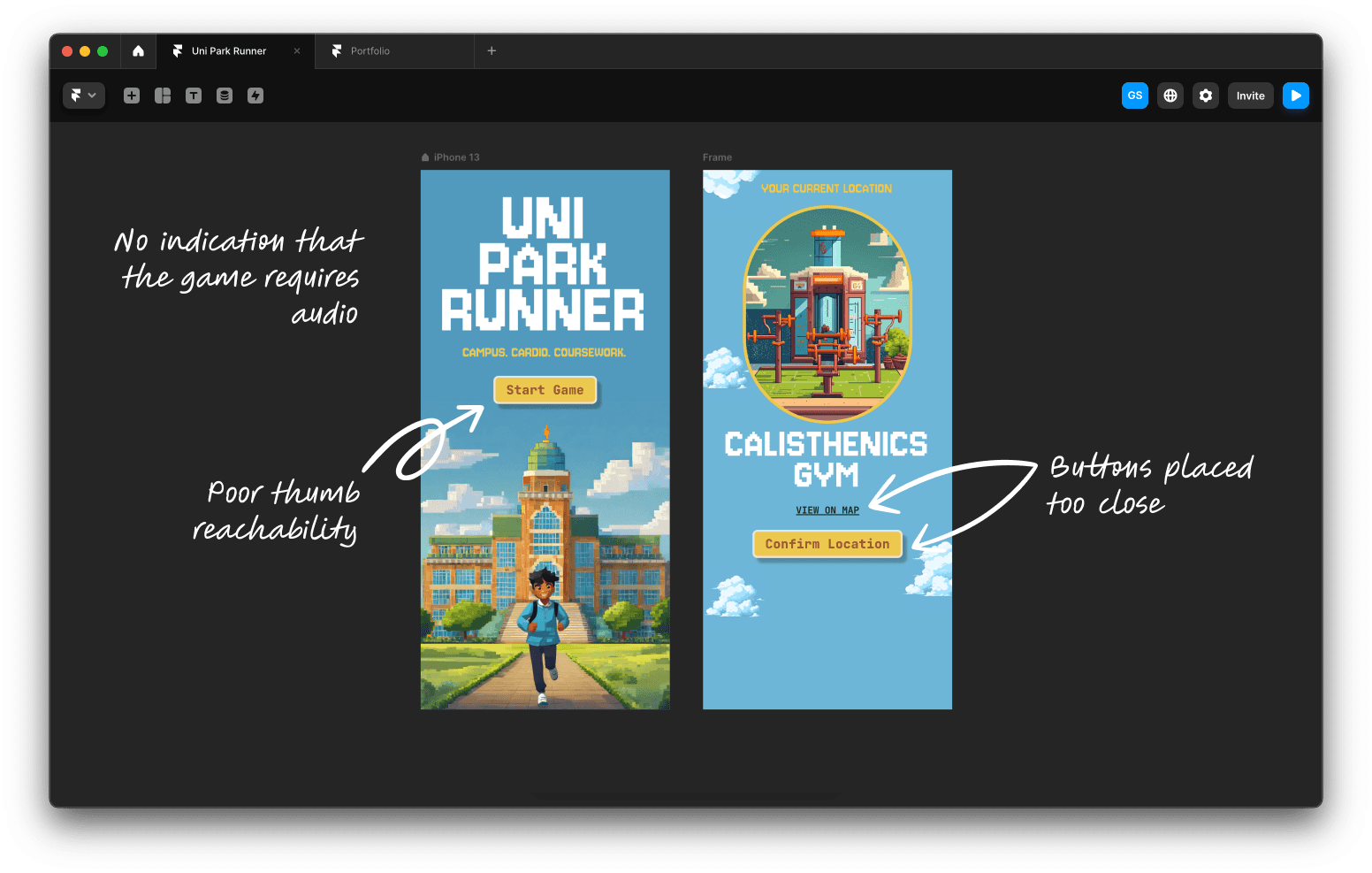
The buttons on some screens are too small.
The pace options don't really make sense.
Clicked the start button, it got reset.
In this iteration, I focused on addressing the issues raised during usability testing, as well as some other problems I identified. I started by pinpointing the issues in the current UI.
Identifying issues in the current userflow
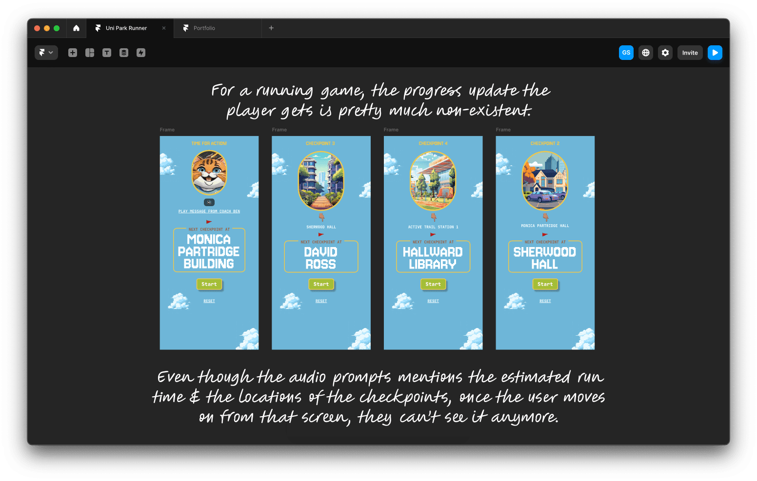
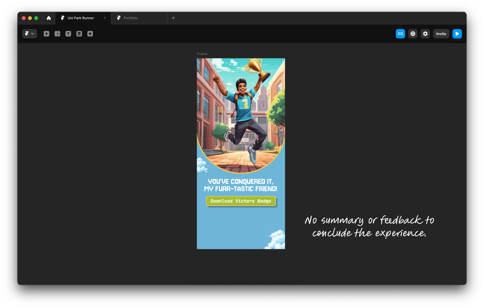
Even though I've created a fairly linear user flow, there are still some redundant steps in the process to start the game. Additionally, the progress updates for players are insufficient, and the game ends abruptly without providing any summary or collecting feedback from users.
I believe this happened because of insufficient persona development which led to poor requirement gathering.
Refined User Personas
Persona 1
Ramon (The Campus Runner)
21, University Student
Fitness level - Intermediate
Tech Savviness - High
Goals
Integrate running into a busy college schedule.
Seek engaging and interactive ways to stay fit.
Utilise campus resources for fitness routines.
Motivations
Enjoys gamified experiences to make exercise enjoyable.
Values competitive and social elements in fitness.
Needs
Clear and engaging instructions for a seamless experience.
Flexible pacing and workout duration options.
Easy interaction with the game’s features.
Challenges
Juggling academic responsibilities with workout routines.
Maintaining motivation for regular exercise.
Persona 2
Alex (Fitness Noob)
24, Recent Graduate, Works part-time
Fitness level - Beginner
Goals
Build a running habit.
Stay motivated to exercise regularly.
Find an engaging fitness experience.
Motivations
Needs a motivating push to stick with running.
Prefers easy-to-follow workout routines.
Needs
Struggles staying motivated and consistent.
May find it hard to follow detailed instructions while running.
Challenges
Motivation and encouragement through the game.
Option to control pace and run duration based on daily availability.
User requirements derived from the personas
Provide Scheduling Options
Needs easy-to-follow progress updates
Run summary & feedback forms
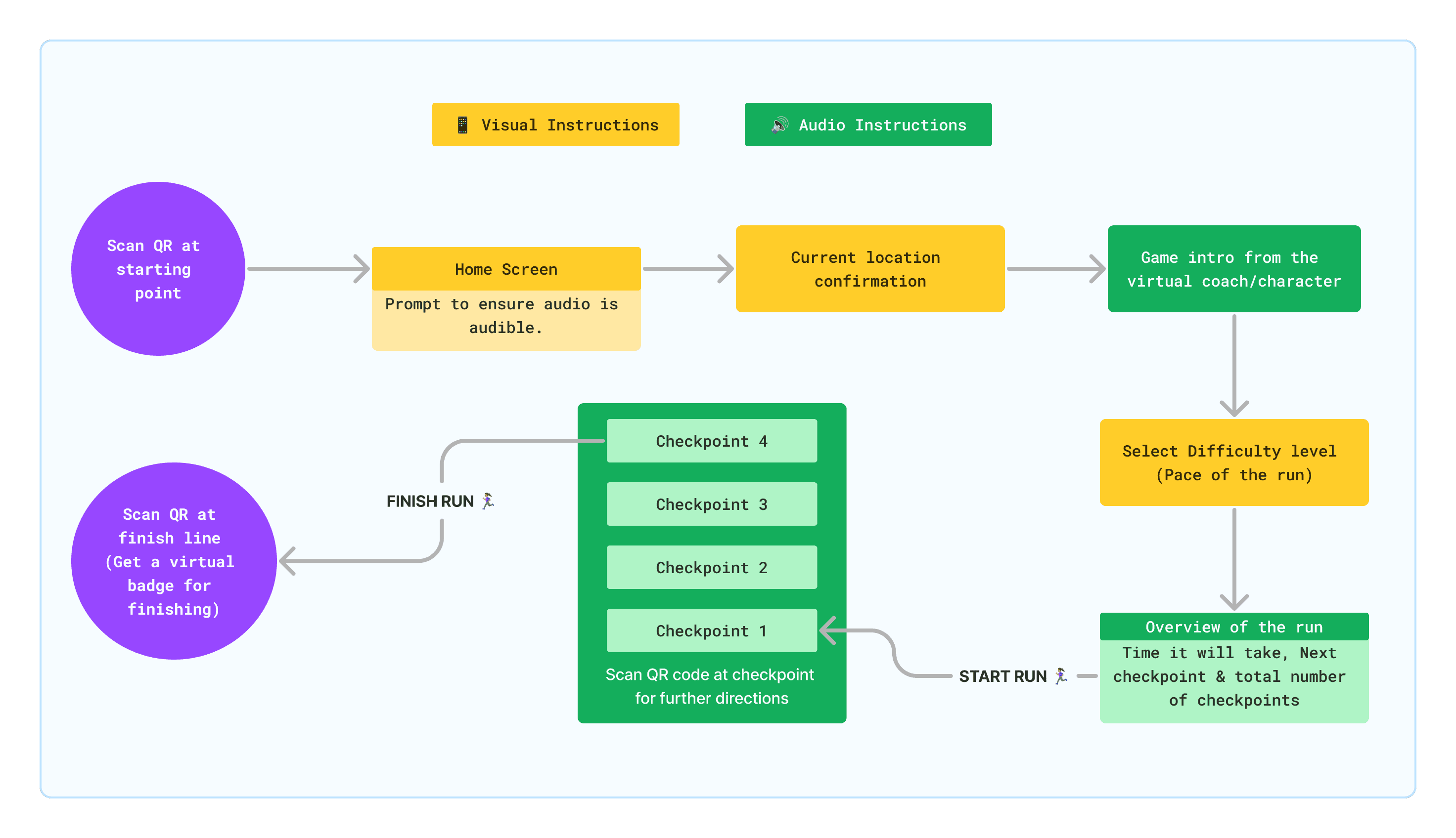
Refined Userflow
Persona 1
Ramon (The Campus Runner)
21, University Student
Fitness level - Intermediate
Tech Savviness - High
Goals
Integrate running into a busy college schedule.
Seek engaging and interactive ways to stay fit.
Utilise campus resources for fitness routines.
Needs
Clear and engaging instructions for a seamless experience.
Flexible pacing and workout duration options.
Easy interaction with the game’s features.
Motivation
Enjoys gamified experiences to make exercise enjoyable.
Values competitive and social elements in fitness.
Challenges
Juggling academic responsibilities with workout routines.
Maintaining motivation for regular exercise.
Persona 2
Alex (Fitness Noob)
24, Graduate, Works part-time
Fitness level - Beginner
Tech Savviness - Moderate
Goals
Build a running habit.
Stay motivated to exercise regularly.
Find an engaging fitness experience.
Needs
Struggles staying motivated and consistent.
May find it hard to follow detailed instructions while running.
Motivation
Needs a motivating push to stick with running.
Prefers easy-to-follow workout routines.
Challenges
Motivation and encouragement through the game.
Option to control pace and run duration based on daily availability.
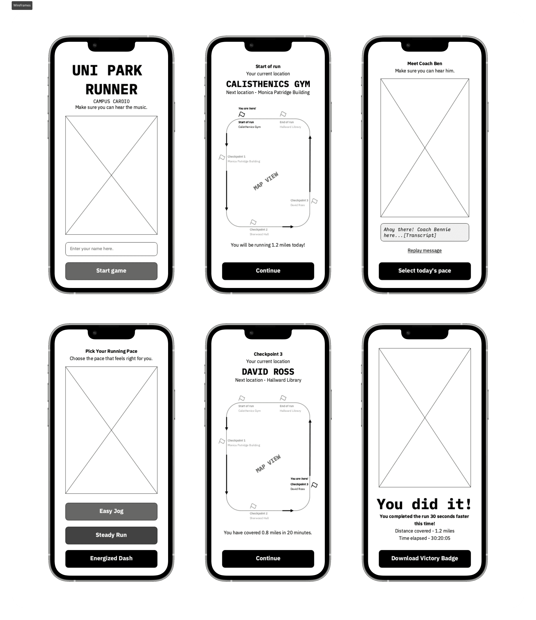
It might look a bit complex, but I’ve broken down the information and actions for each page to make sure I don’t miss anything. This also made the wireframing and wireflows a lot easier.
Next, I moved on to creating wireframes
Honestly, while sketching these wireframes, I wasn’t quite sure how to visualise the checkpoints and run progress. So, I concentrated on organising the information and actions on the screens according to the user flow to see if it made sense.
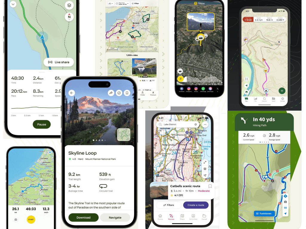
Visual research
I started checking out apps that use locative media—basically ones that visualize locations and track where players are. This really helped me figure out how to show checkpoints and run progress. I also wanted to see how the game visualises run/trail information from beginning to end.
While this process was useful, I needed to make sure the information was also communicated clearly through the audio prompts. Since the player will mostly depend on these audio cues for navigation, it’s crucial that they’re well-crafted.
Redesigning the UI
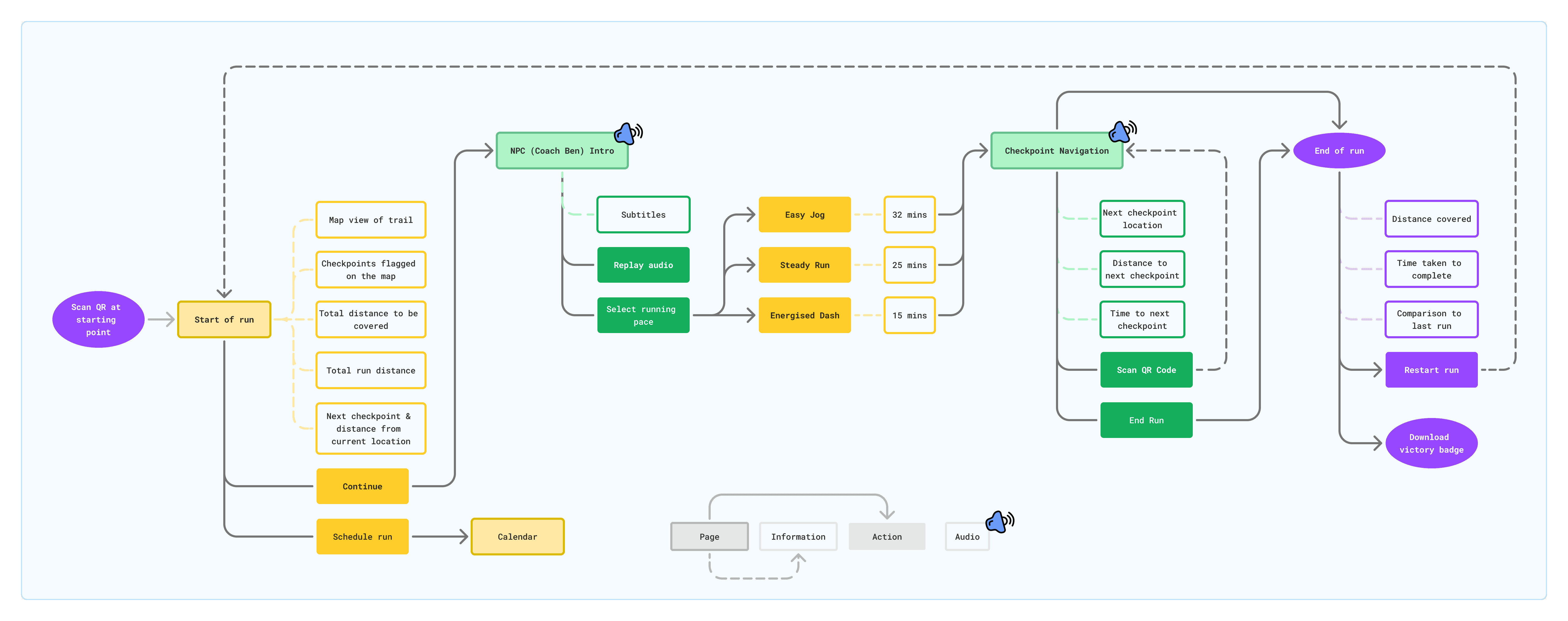
With clarity on how to organise the information and actions, I started by identifying the mistakes I made on the UI the first time.
Creating a Design System
Well, not really 🫠 Since it’s a small game that I don’t plan to scale and relies heavily on audio-based navigation, I didn’t intend to create a design system.
With all the varying definitions of "Design System" out there, I decided to follow Figma's definition to keep things clear. According to the definition, what I have created here is a Component and Pattern Library, along with Foundational Elements.
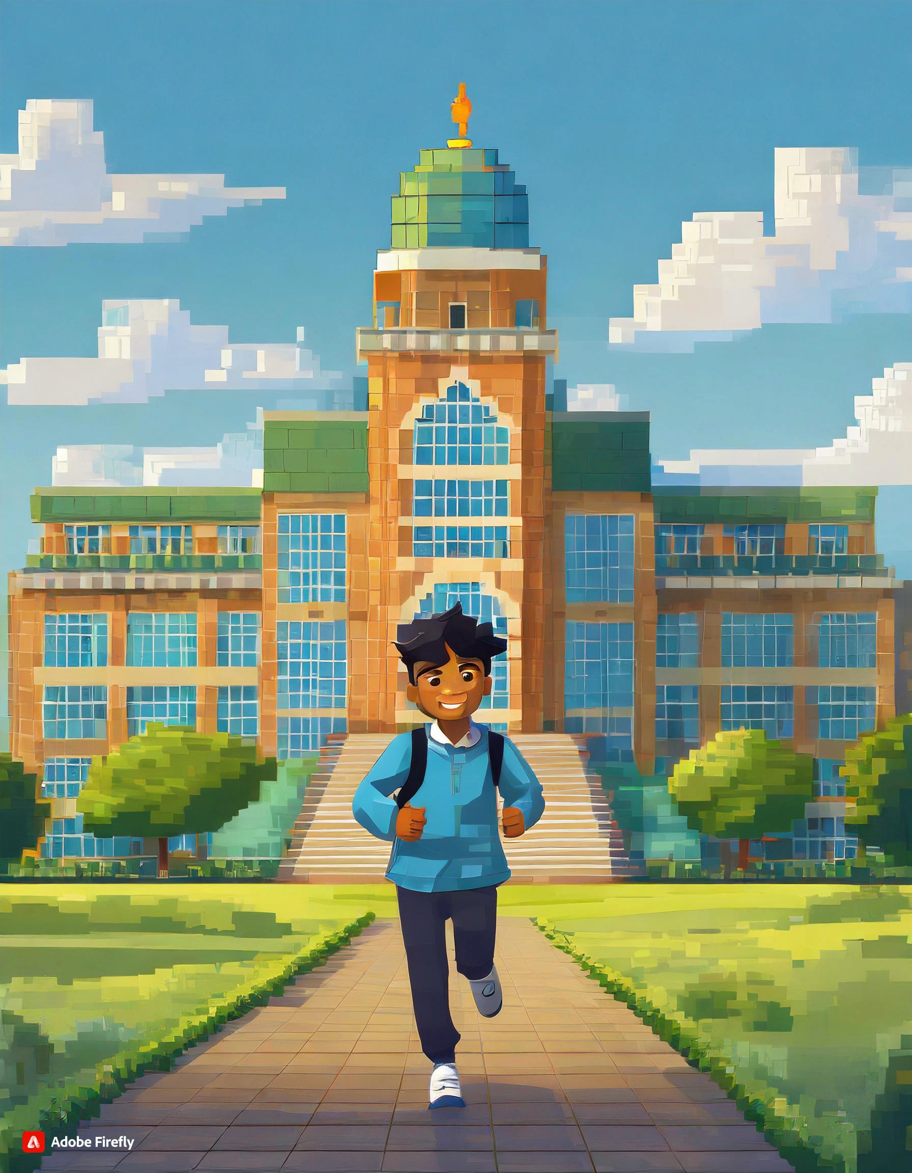
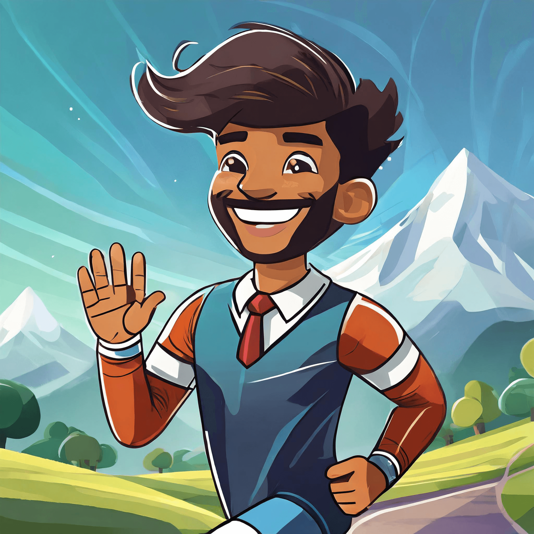
For the visual aesthetics, I created a colour palette based on the image below that I generated using Adobe Firefly. Prompt I used was "College student running in front of a college building."
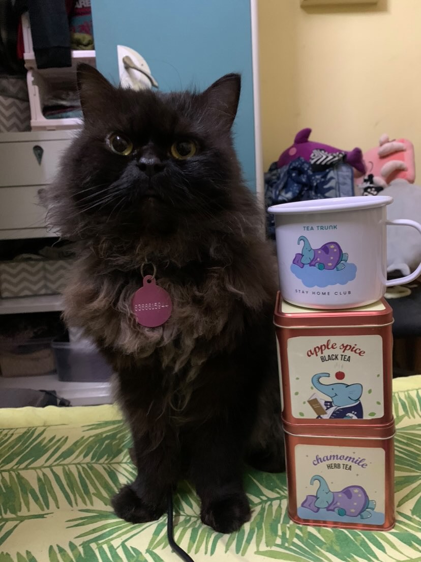
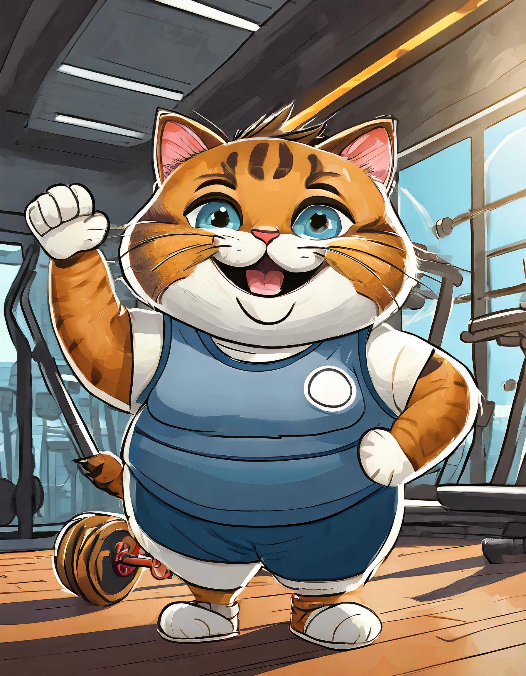
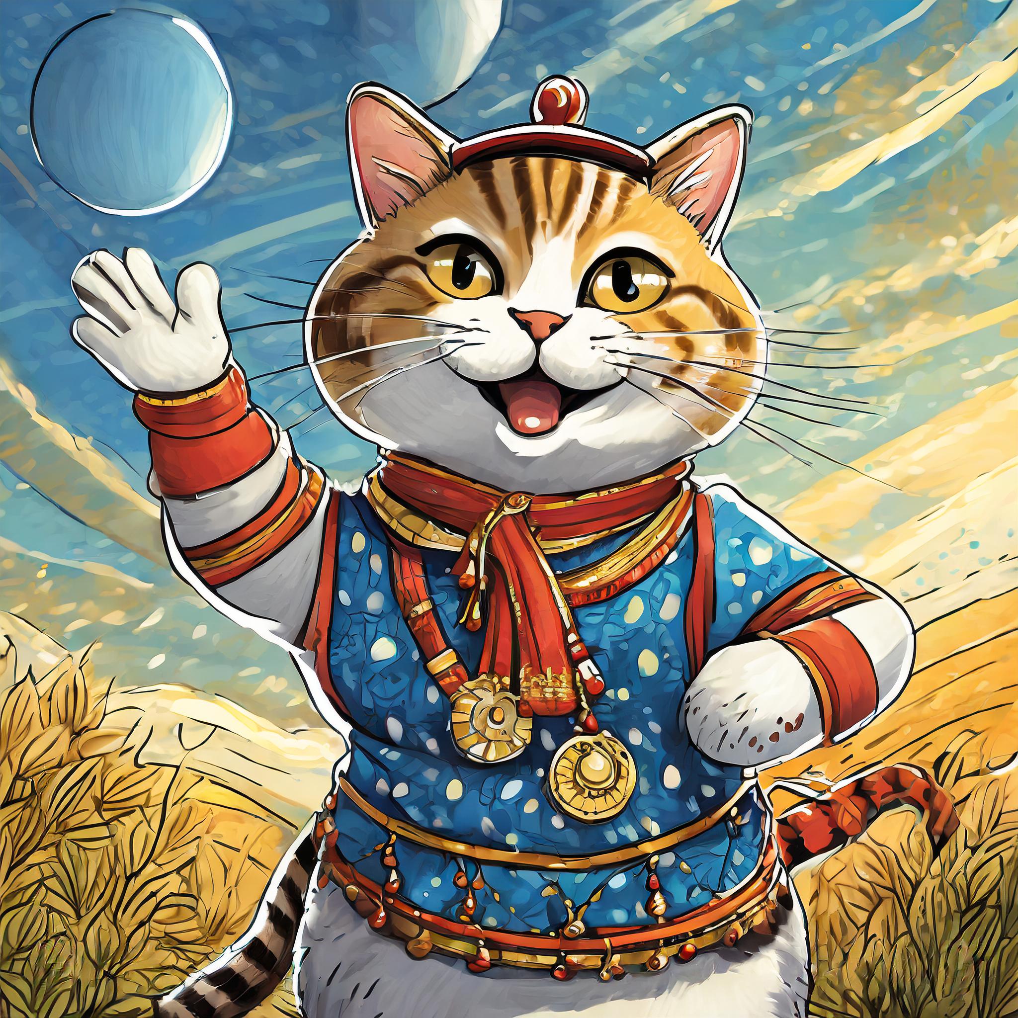
Coach Ben was also created the same way. I used the prompt "A fat cat that looks like a gym trainer" and provided a picture of my cat as a reference.
I aimed to keep the UI playful, cheerful, and bright. I believe the colours fit this vibe and also enhance the overall aesthetic I was going for.
Time put it all together!
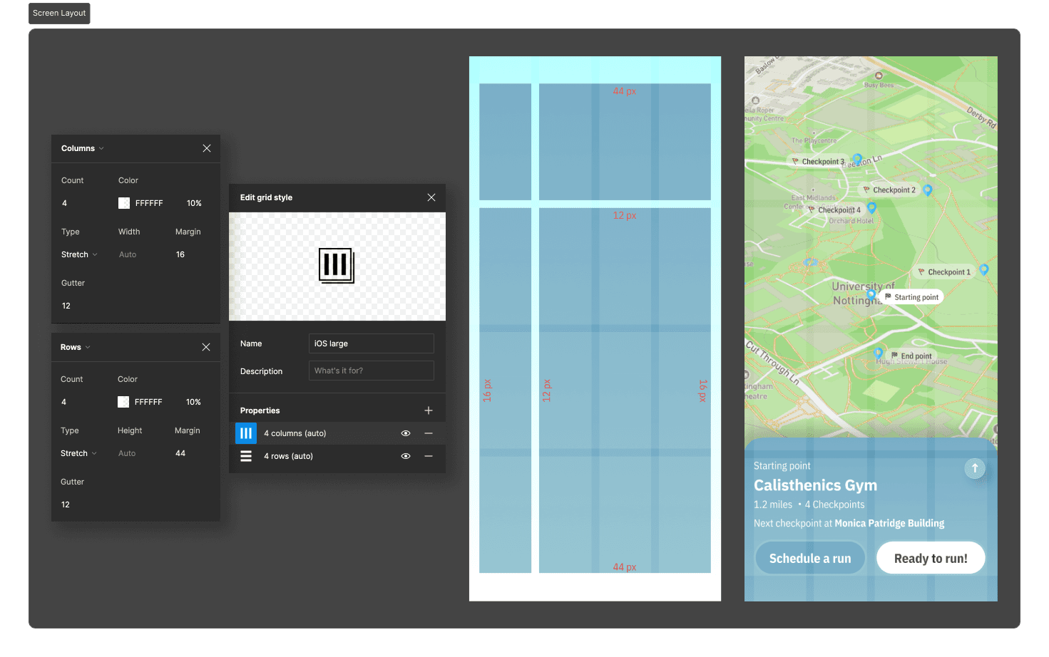
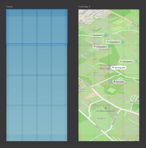
I began by setting up a grid for the screen layout to account for elements like the dynamic island/notch at the top, and the dock at the bottom. This ensured a consistent and well-organized UI throughout the design process.
After this, the process was quite straightforward as I began adding UI elements to the screens.
One point worth mentioning is my initial hesitation about using the map view. I was concerned that it might give users a false impression of live-tracking, which wasn't actually happening. However, after reviewing several similar apps, I realised that this map view is familiar and expected by users for location-based information, making it the best choice.
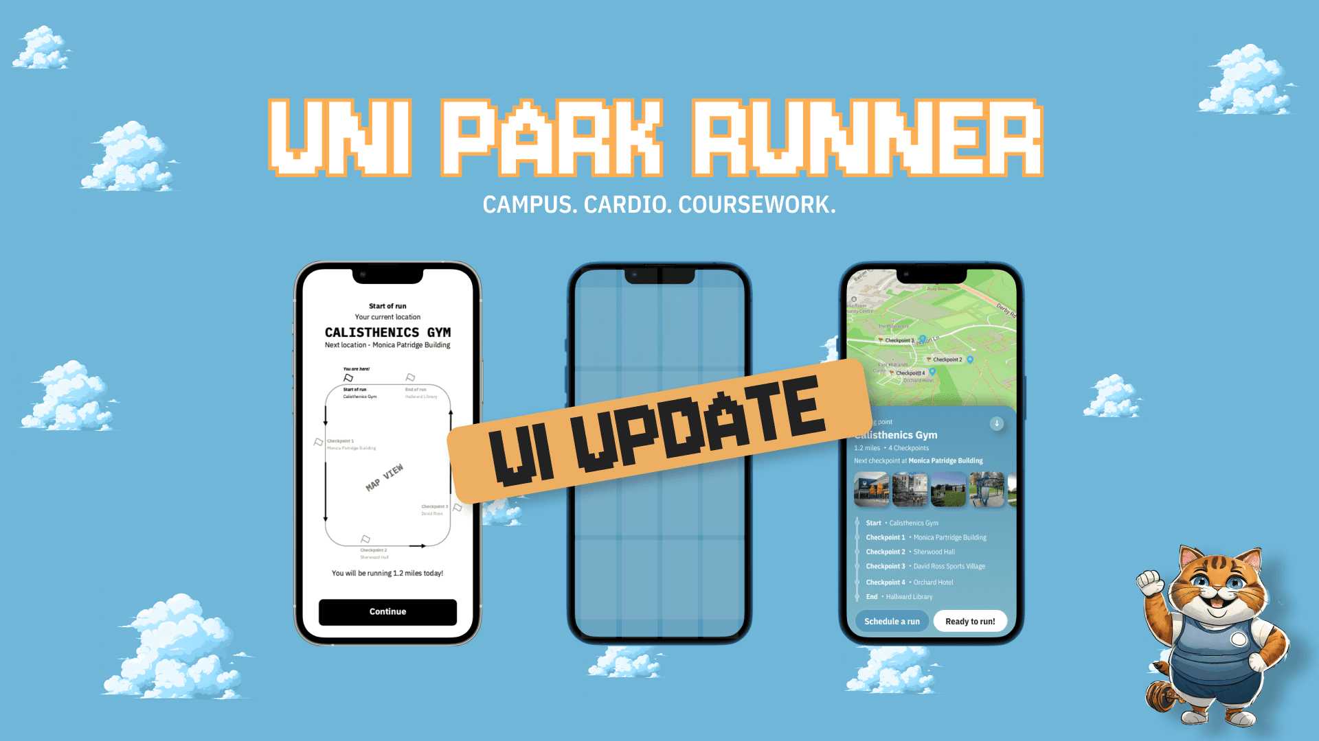
Here are the final results!
Starting the run
Starting the run
Adjusted button positions and sizes to enhance accessibility, and relocated them to improve thumb reachability.
Provided clear prompts on each screen, complemented by audio instructions.
Renamed running pace options to more clearly indicate their difficulty levels.
Subtitles that display on-screen while the NPC speaks enhance accessibility.
Checkpoints are fully listed and mapped for improved visual clarity.
Through the run
Through the run
Implemented running progress updates, tracking both time and distance left.
Added functionality allowing players to end their run at any desired point.
Implemented dynamic UI elements that visually adjust their state according to the player's running pace.
Included prompts advising players to take a break if they show signs of discomfort.
End of run
End of run
Summary of run, total time taken and distance covered.
Added functionality allowing players to restart the run.
Option to add provide feedback about their running experience.
My take
In designing this game, I didn’t follow the usual design process. Instead, I jumped straight into creating a rough user flow and built a prototype in Framer after some brainstorming and research. This led to a few issues, but I managed to get a working prototype ready for testing within 3 weeks!
I decided to refine the concept and fix the issues after receiving positive feedback from users and professors. Their inputs showed that it was worth investing more time and resources.
From my experience at Schneider, I learned that tech leaders want to see a working prototype before committing more resources, no matter how rough it looks. You need solid evidence to justify further investment, which means starting with a basic prototype and getting initial feedback. If the prototype gets positive reviews, that’s when you refine and improve.
In my current academic setting, I usually only have time for one iteration, but I always end my reports with a plan for what I’ll fix next based on feedback & plan to use the same approach.