Problem Statement
Multiple IC teams built their own GUIs in isolation, resulting in -
Steep learning curves for technicians juggling different tool.
Inconsistent usability due to varied design approaches.
Stakeholder hesitation to unify platforms across the company.
Contracted as an Independent UI/UX Designer by Mirafra Technologies for an IC Manufacturer from Dec '24 to Feb '25.


Primary users
The product served 3 main user groups across the company. Prioritised based on frequency, complexity, and dependency.
Use it to monitor and modify IC registers during operations.
Rely on it for developing new configurations and validating performance.
Need these legacy GUIs for live demos and customer discussions.
Process
Here’s how I redesigned the interface—from chaos to clarity, in 4 structured steps.
Step 1
Understanding the existing system and identifying user requirements.
We began by reviewing manuals and logging startup times to understand the learning curve.
Manuals were inconsistent or outdated.
Error messages lacked clarity, and system feedback was minimal.
UI elements were poorly organised, creating friction for new users.
We also interviewed developers and stakeholders to understand the design decisions behind existing tools.
Devs often assumed users would "figure it out" without proper guidance.
Despite different tools, many workflows overlapped—highlighting opportunities for a unified experience.

Step 2
Brainstorming & Wireframing with different IC Teams
We kicked off the design phase by sketching LoFi wireframes on whiteboards, collaborating closely with IC teams to align on structure and workflows early.
To evaluate progress, we created HiFi wireframes in Figma and ran three rounds of demos—tracking task completion times at each stage.
What we learned -
1st draft
Users struggled with navigation and couldn’t complete key tasks.
2nd draft
Added context helped, but some screens were still distracting—tasks were completed ~25% faster.
3rd draft
With clearer flow and feedback, users completed tasks ~50% faster.
Step 3
Designing & Refining the UIs
Working within the existing design system, we crafted new UI elements to meet user needs uncovered during earlier testing.
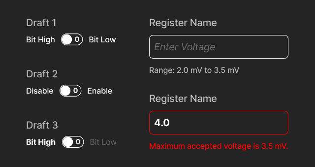
These included clearer labels, inline validations, and control states that better reflected real-world hardware constraints.
Rather than redesigning entire screens, we focused on improving key components—like toggles, inputs, and error messages—so users could complete tasks without needing to reference a manual.
The goal -
Make the interface self-explanatory at every step.
We tested each iteration with engineers, sales & marketing teams, using A/B testing and feedback sessions to guide 4 rounds of refinement.
Small adjustments—like reworded states or more descriptive prompts—had a noticeable impact on user confidence and speed.
Step 4
Handoff to Dev Team
We wrapped the project with a structured handoff to the development team, focusing on clarity, consistency, and feasibility.
Detailed UI specs and component documentation covering all edge cases and states.
Interaction guidelines for transitions, animations, and user flows—aligned with what was tested in prototypes.
Design tokens (built using CSS) to speed up implementation and maintain visual consistency across modules.
Throughout the handoff, I worked closely with developers to answer questions, adapt to constraints, and make sure design decisions held up in production.
The goal -
No surprises during build. Just clean handoff, and cleaner collaboration.
The result?
Faster onboarding, smoother workflows, and a design system that’s ready for whatever comes next.

Redesigned flows, better UI feedback, and clearer controls helped new users get started faster—without needing a manual.
In-product prompts and real-time feedback replaced guesswork, reducing confusion and improving confidence during tasks.
The updated design system made it easy for dev teams to integrate new IC categories without reinventing the UI.
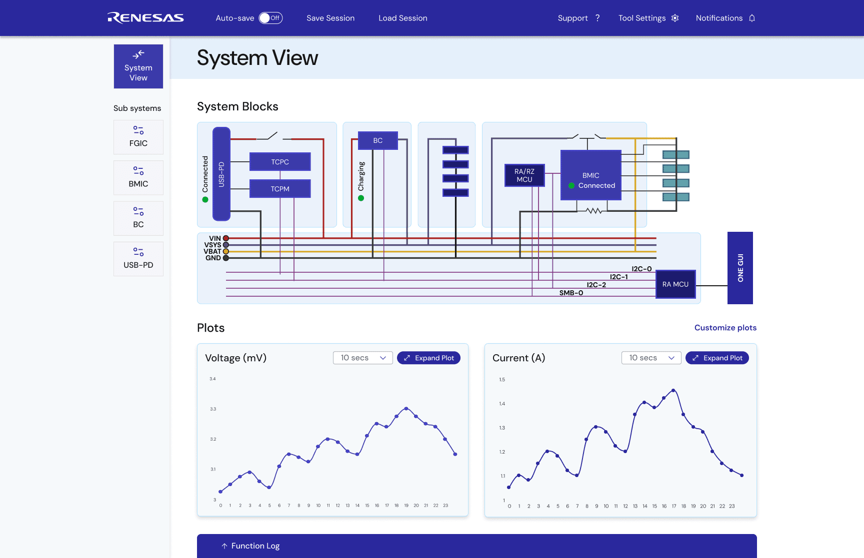
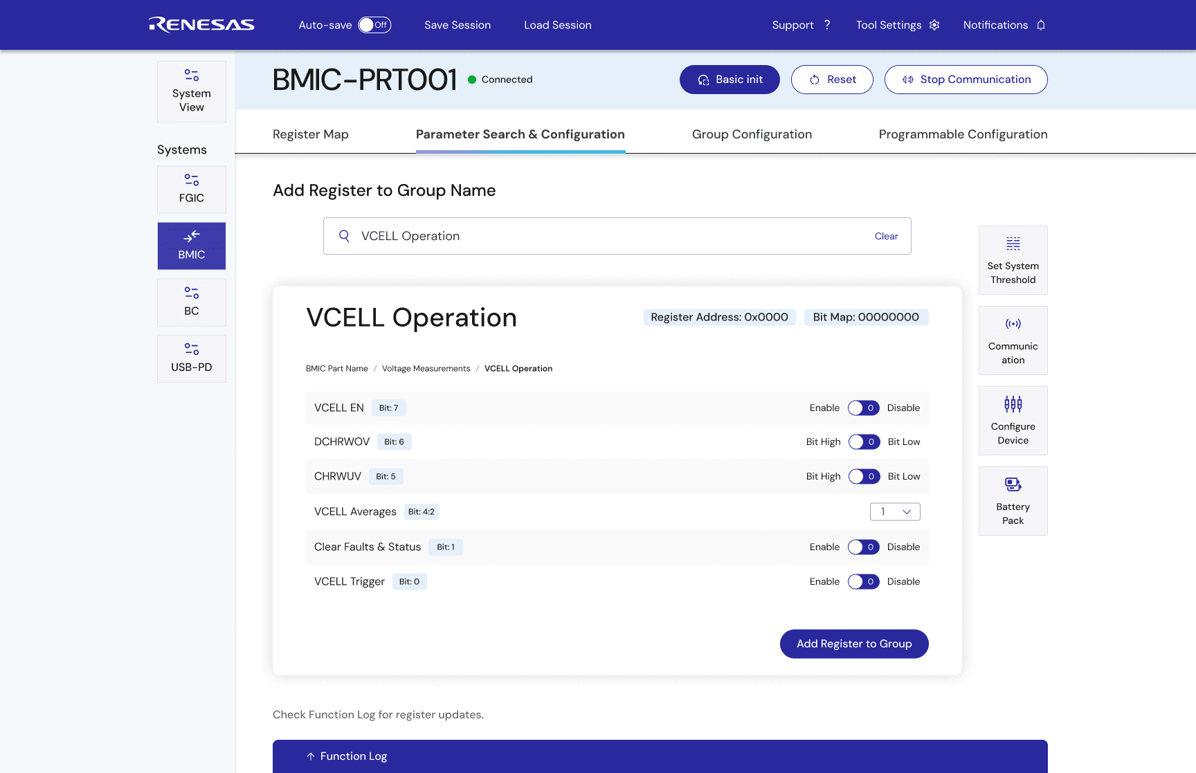
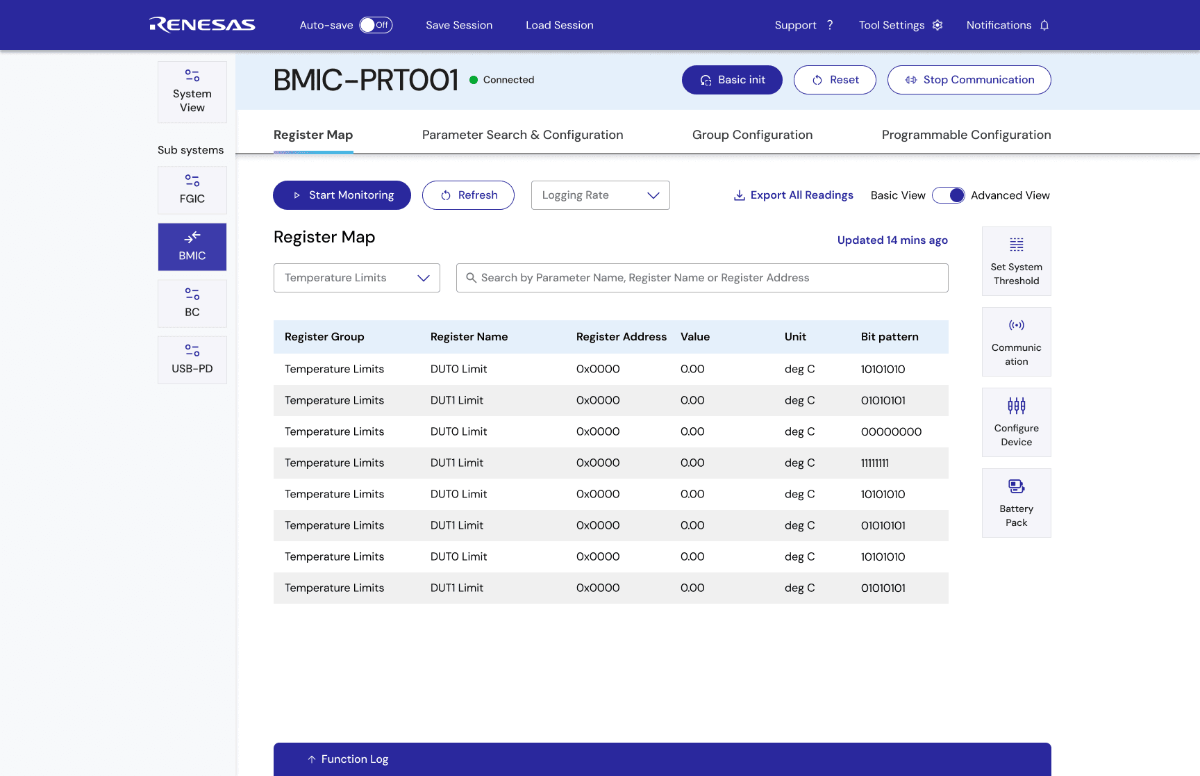
Final wireframes and screens have been redacted due to NDA restrictions. If you’d like to learn more about the process, outcomes, or my role—feel free to reach out.

